As the investigation of the crash of Asiana Flight 214 proceeds, it’s becoming clear that the aircraft flew an unstabilized final approach into San Francisco International Airport (KSFO). That unstabilized approach by itself did not cause the accident. However, it may have been a contributing factor, as the need to reduce power significantly due to excessive airspeed and altitude on short final masked the fact that the autothrottles had been inadvertently disengaged. By the time the crew realized that the autothrottles were disengaged and airspeed was dropping, it was too late to execute a timely go-around.
So any investigation into the accident is likely to look at airlines policies, as well as de facto practices, regarding unstabilized approaches. In this post, I compare the approaches into KSFO of two airlines (Asiana and United), and show that there are some striking differences in the way that approaches are flown by the two airlines, at least over the time span I looked at. It’s impossible to tell from the data whether those differences result from training, airline policies, degree of compliance with airline polices, or some other factor. Indeed, the data sets are small enough that we probably can’t draw firm statistical evidence. But the data is suggestive enough that I believe the issue warrants further research.
See all my posts on Asiana Flight 214 here.
Methodology
I looked at all the Asiana Flight 214s and United Flight 852s from mid-May through mid-July of this year. I eliminated from the dataset flights that appeared to have bad data points, such as obviously erroneous positions or altitudes. In addition, I only included approaches that were more or less on a straight-in approach to runway 28R or 28L from 5 miles out, where the final approach courses cross the San Mateo bridge. I also eliminated approaches where the last radar data point was 3 or more miles from the runway touchdown zone. Fortunately, KSFO has very good radar coverage, with many flights having data down all the way down to 100 feet, about a third of a mile from touchdown. The final dataset had 52 Asiana flights, and 55 United flights.
The flights are fairly closely matched. AAR214 and UAL852 land close to the same time each day. Both flight originate in Asia (AAR214 in Korea and UAL852 in Japan) and are nonstop to KSFO. Both airlines fly Boeing 777-200s or 777-200ERs on the route. So the comparison between the approaches should be pretty good.
I should warn you that there is a very small amount of math in this post (this is Flying Professors after all). But bear with us, because there is an important story here.
The Data
Let’s begin by looking at the United flights. We’ll start with a plot of altitude vs. distance from the touchdown zone for the runway:
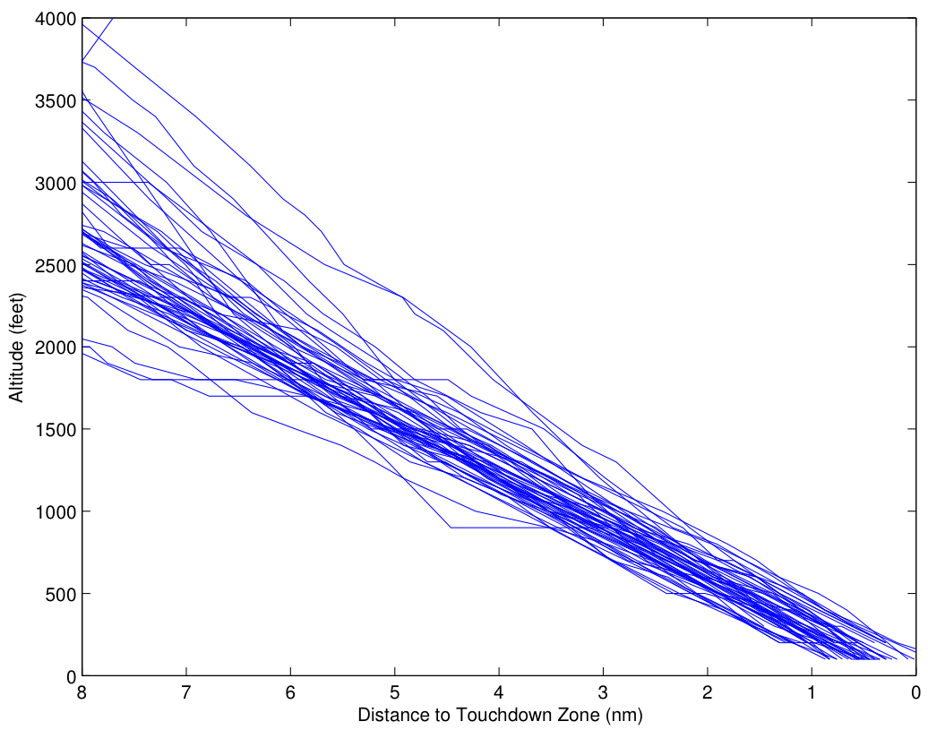
What you can see is that starting 8 miles out, there is a fairly wide dispersion of altitudes, ranging from 2000 feet to 4000 feet, with a nominal, on-glideslope altitude of about 2500 feet. However, most of the approaches start out within about 200 feet or so of the nominal, with a significant number of outliers, especially on the high side. The slope of most of these outliers is steeper than the nominal 3 deg glideslope, so that the aircraft approaches the nominal glideslope to intercept the glideslope at or before 3 miles out. It’s clear that the pilots (or autopilots) are making concerted efforts to be on glideslope by 3 miles out. Closer in, there is a dispersion of maybe ![]() feet. Most of that dispersion is likely altimetry error, either on the aircraft, or in the correction from pressure altitude to absolute altitude.
feet. Most of that dispersion is likely altimetry error, either on the aircraft, or in the correction from pressure altitude to absolute altitude.
(It’s worth noting that it would be great to have the data from the quick access recorders (QARs) on the aircraft. Of course, that’s not publicly available. The altitude data from the QARs could be corrected for field pressure and altitude encoder errors almost perfectly, by noting the indicated altitude once the aircraft has landed, which of course is field altitude. Furthermore, the QAR data has a higher rate than the FlightAware data.)
The groundspeed data tells a similar story. (Of course, we would prefer to have airspeed, but that’s not available from FlightAware.) Here’s the plot for groundspeed:
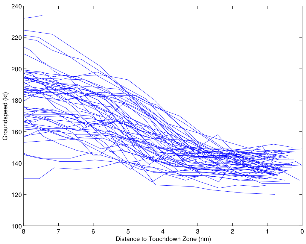
Eight miles out, the airspeeds range from 130 kt to 220 kt. ATC will often restrict the speed of aircraft to control the spacing between aircraft, so this variation is not unusual at all. However, as the approach proceeds, the airspeed needs to approach the target airspeed for the approach. Note here that the average approach 8 miles out is about 180 kt, and begins slowing 6 miles out, reaching about 140 kt by 3 miles out. Again, there is a fairly obvious “funneling” effect here, where the speeds have a wider dispersion early on, and are driven to a narrower dispersion around the desired approach speed by about 3 miles out.
Now let’s look at the Asiana data, paying particular attention to both the similarities and the differences. We’ll start with altitude:
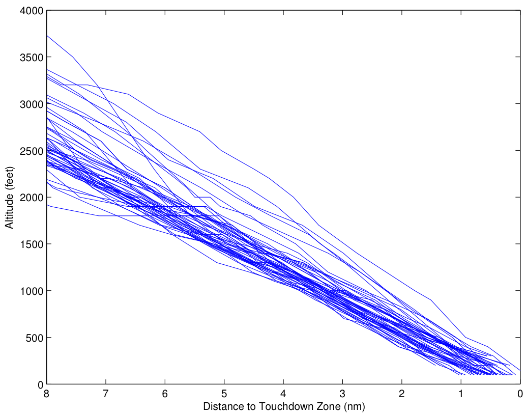
As was the case for United 852, there is significant dispersion in the initial altitude, which is not unusual. Also as in the United case, the altitudes converge (more or less) to the desired glideslope. However, note that the convergence to the glideslope appears to be less intentional or systematic, with four outlier cases that don’t intercept the glideslope until 2 miles or less out. Indeed, for about a half dozen approaches, it appears that there is no correction at all for being high on glideslope until about 4 miles out.
One sees a similar result with the groundspeed for the Asiana flights:
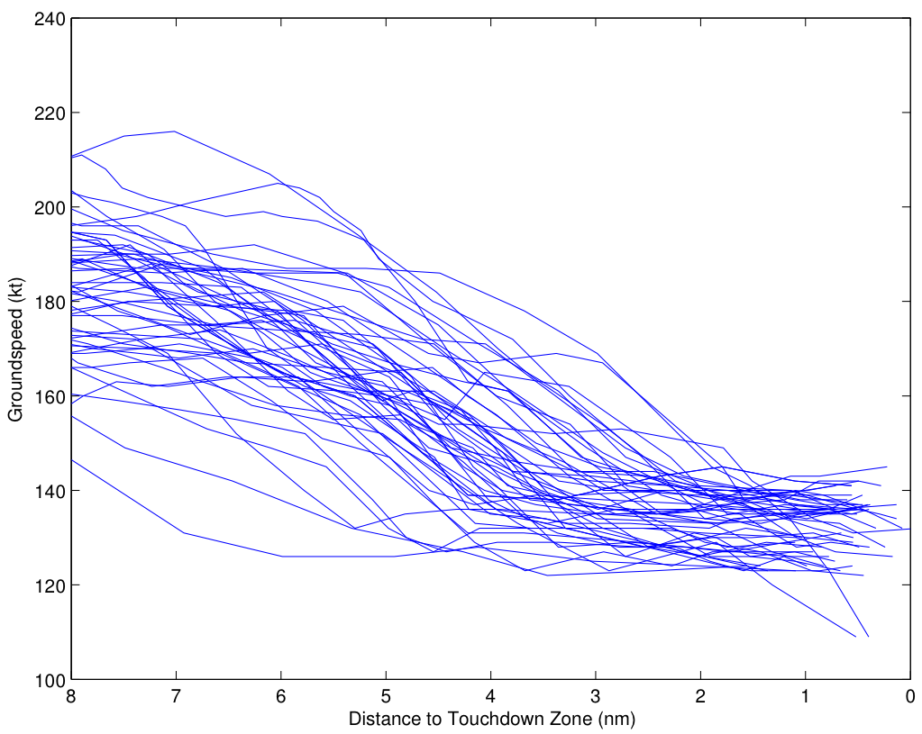
As in the United case, there is a fairly wide dispersion of airspeeds 8 miles out. The dispersion does generally reduce as the distance to the runway narrows, with the airspeeds converged more or less at 2 miles out. Again, though, the corrections appears to come later in the approach, and are apparently less intentional and systematic.
(As an aside, it seems as though it might be possible in both the United approaches and especially the Asiana approaches which are hand flown and which are flown on autopilot, just by the general character of the curves.)
The plots above generally show that Asiana has more high energy, high and fast approaches. To confirm that quantitatively, I’ve plotted the distribution of the energy height at 3 miles out for each approach. The energy height is the total potential plus kinetic energy of the aircraft, normalized by its weight, and is given by [h_E = h + frac{v^2}{2g}] where ![]() is the altitude of the aircraft,
is the altitude of the aircraft, ![]() is its velocity (here groundspeed, but more properly airspeed),
is its velocity (here groundspeed, but more properly airspeed), ![]() is the mass of the aircraft, and
is the mass of the aircraft, and ![]() is the acceleration due to gravity.
is the acceleration due to gravity.
OK, the last bit of math you need: A distribution is just a plot of values (such as the energy height of a specific flight) on the ![]() axis, vs. the percentile of the data that that value represents on the
axis, vs. the percentile of the data that that value represents on the ![]() axis. That is, if 80% of the data is less than, say, 2000 feet, then there is a data point plotted with
axis. That is, if 80% of the data is less than, say, 2000 feet, then there is a data point plotted with ![]() value 2000 feet and
value 2000 feet and ![]() value 80%. I’ve plotted the distribution on Gaussian probability paper, which is almost magic — it has the property that if the random value being plotted has a Gaussian distribution (remember the bell curve from high school?), then the plot of the distribution is a straight line. So here’s the distribution of total energy 3 miles out for the United flights:
value 80%. I’ve plotted the distribution on Gaussian probability paper, which is almost magic — it has the property that if the random value being plotted has a Gaussian distribution (remember the bell curve from high school?), then the plot of the distribution is a straight line. So here’s the distribution of total energy 3 miles out for the United flights:
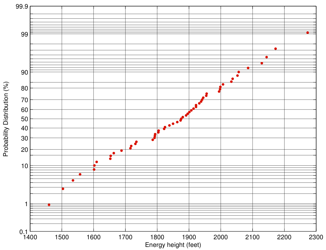
This plot tells us a lot at a glance! Because the plot is nearly a straight line, the distribution is nearly Gaussian. Because it’s Gaussian, the mean is at the 50th percentile (the median), which by eye is about 1870 feet. In fact, the mean is 1855 feet. The standard deviation is the distance from the 50th percentile point to the 84th percentile point, which turns out to be 176 feet.
Now let’s look at the distribution for Asiana 214 flights:
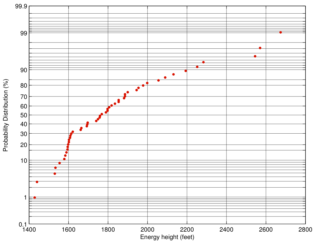
The distribution is decidedly non-Gaussian, which indicates that something interesting is happening here. In particular, note that the distribution on the high energy side is stretched out, with three outliers far to the right. These outliers have the equivalent of 800-1000 feet more energy than the median approach. That’s a lot of excess energy that must be dissipated before landing. In addition, the standard deviation is significantly larger, 277 feet, although the real story is in the outliers.
Yet another way to look at the data is to plot airspeed and altitude for each flight at three miles out on the approach. That plot is below, with blue representing United, and red representing Asiana:
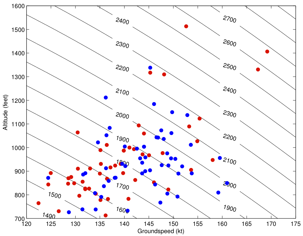
The black lines are contours of constant energy height, and each contour line represents an additional 100 feet. High energy trajectories are in the upper right corner. The first thing that stands out about the plot is that the three big outliers in energy are all Asiana flights. Not surprisingly, the highest energy outlier is Asiana 214 on the day of the crash.
Even of the six highest energy approaches, only one is from United. In the two plots below, I’ve plotted the time histories of the energy height of all 107 flights from 8 miles out to touchdown. The six highest energy flights are indicated in red. Let’s look at the United flights first:
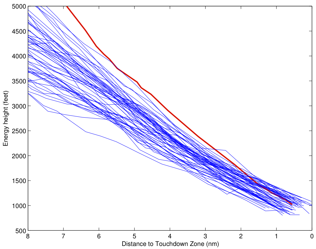
The red curve is the highest energy approach. At the San Mateo bridge, it’s 500 feet or so above the median approach, a little high, but not excessively. But the slope (rate of decrease of energy) is steep enough to keep the approach at a reasonable energy. By 3 miles out, it’s at 145 kt, close to its target speed, and maybe 250 feet high. It’s flying a slightly steeper approach, but with stabilized airspeed, and tracking in nicely toward the nominal glideslope.
The high-energy Asiana approaches give a completely different impression:
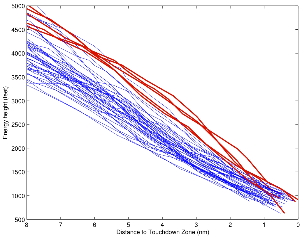
At 5 miles out, there are a half dozen or so flights 500-1000 feet above the nominal glideslope. Several of these are dissipating energy at the same rate as the nominal approaches, meaning that intially at least, they are making no progress toward returning toward a stabilized approach. Two of these approaches don’t dissipate the required energy until less than 2 miles from touchdown, and a third doesn’t reach the required energy state until less than a mile from touchdown. Indeed, in that approach, corrective action is not taken until less than two miles from touchdown.
Implications
What are the implications of these data? Although the dataset is not large, it seems possible that there is a structural issue (training, airlines policies, ATC issues, etc.) that is leading to Asiana flying high energy, unstabilized approaches (or failing to go around when they do, since my data doesn’t include cases where flights go around). Of course, it’s impossible to differentiate between, say, a training issue and an airline policy issue by looking at the data here. But if you believe that flying an unstable approach was a contributing factor in the Asiana 214 crash (my tentative opinion is that it was), and the apparent higher rate of unstabilized approaches by Asiana in this limited dataset is real, then there is an important issue that the NTSB and FAA should investigate.
As an aside, there’s been no shortage of cultural explanations for the crash, including assertions that Korean pilots engage in too much rote learning, or that they defer too much to senior pilots because Korean culture emphasizes respect for elders. Please don’t construe this post as supporting that position. Whether there are significant cultural issues (national or corporate) that contributed to the crash can’t possibly be determined from the data presented here. Our focus at Flying Professors is on the math and physics of flying and the joy that that brings (and least to a certain geeky demographic), and we’d like to keep it that way. But please see the article by James Fallows at the Atlantic for a nice discussion about the role of culture in Asiana Flight 214 (and also for some kind words about Flying Professors).

Wow. Really, wow.
I’m an MD11 pilot. At my company, there are strict stabilized approach criteria: fully configured, on speed, engines spooled up, on glidepath, and checklists complete. There are two gates at the pilot flying (PF) must meet those criteria: 1,000′ above field elevation (AFE) if the field is reporting less than 1500/3, or 500′ AFE if the weather is 1500/3 or better.
There are a couple operative terms here: speed and glideslope. The speed bracket is from Vref (bugged approach speed) -5 knots to +10 knots. Glidepath is less well defined, but within the decision regime (1500′ above AFE) for Cat III approaches, the aircraft must be within one dot of on ILS glideslope.
Until now, I never gave a moment’s thought as to precisely what “one dot” means in terms of angular difference. Near as I can tell, and it was surprisingly difficult to find an answer, “one dot” is .35º. At 1000′ AFE, that amounts to a Cat III altitude error of (doing head math here) 117′.
Accordingly, at 1000′ AFE (or 3.33 miles from the glideslope point of intercept with the runway), if the aircraft is lower than 883′ AFE, or above 1117′ AFE, then it is outside the acceptable Cat III criteria.
For a visual approach, the gate is 500′ AFE, so the required altitude at 1.67 miles is 500′ AFE +/- 58′.
Presuming my head math and memory is right, almost all of the United approaches, in terms of altitude v. distance, are steep. But that doesn’t correspond with my experience (whether handflown or on the autopilot, almost without exception, the plane is within a dot of the glideslope, regardless of whether the gate is 1000′ or 500′ AFE); therefore, I suspect there is a roughly +250′ bias in the altitude. (IOW, at 3.33 and 1.67 miles, the visual center of the altitude distribution is about 250′ higher than what my barely adequate cranium says it should be.)
Based on the altitude v. distance graphs, there are three United flights that should have gone around at 1,000′ (if the field was less than 1500/3) and none at 500′ AFE.
For Asiana, there were five flights at 1,000′ that might have needed to go around, and one at 500′ that darn well should have, but didn’t.
The ground speed plots are less useful. I haven’t flown into SFO in several years, so I’m not familiar with the winds there. But, to take an extreme example, Narita can have winds that are 25 knots on the tail at 1,000′, and calm at the surface (with GPS and INS, we can see wind speed and direction to the knot and degree). I suspect the wind speed variations with altitude swamp the aircraft deviations from Vref.
Since the equation for hE (in the USAF, we called it “smash”) squares velocity, then the wind effect on groundspeed is going to be especially prominent. That said, the probability distribution of energy height is strikingly different between Asiana and United. If I am reading the graphs properly, Asiana is some combination of higher and faster than United.
… as the need to reduce power significantly due to excessive airspeed and altitude on short final masked the fact that the autothrottles had been inadvertently disengaged.
Just speculatin’ here: While on downwind and on radar vectors, the PF had selected Level Change (aka “idle clamp”). Subsequently, approach control cleared the crew for a visual approach while the aircraft was still high. This clearance leaves it up to the crew when to turn base — they turned in too early.
IMHO, Level Change is grossly overused, and is wildly inappropriate for a visual approach. Since 214 had too much smash, the fact that the engines were clamped in idle wasn’t an issue until the aircraft was on short final. At that point, the aircraft, having blown through the proper glidepath, was extremely shallow, which caused the airspeed to bleed off much more quickly than if it had been on the standard glidepath.
The aircrew failed to notice several Flight Mode Annunciator indications that they were in idle clamp. Then they failed to notice, or act upon, their excessive deviation from glideslope (first high, then low), and (through autothrust induced crippled crosscheck) failed to take on board their going waaaayyyy below Vref.
Apologies in advance for my wordy reply (and even bigger apologies if I typing off the tip of my head has revealed procedural shortcomings or a dire need for proof reading), but analysis as excellent as yours deserves a thorough reply.
In reply to Jeff Guinn immediately above:
First regarding groundspeed. As we mentioned, we really want airspeed, not groundspeed, but groundspeed is all we can get. One of the reasons for presenting the United data is that it does (I believe) give an idea of how much scatter the use of groundspeed rather than airspeed produces. We would dearly love to have the QAR data, but it’s not available.
In regards to altitude, from the data it really appears that there is significant altimetry error, which I believe to be in the correction from pressure altitude to absolute altitude. (BTW, because KSFO is only 13 feet above sea level, I haven’t bothered to make the distinction between MSL and AFE.) Indeed, if you look at individual approaches, some are clearly ILS approaches, straight as an arrow, but offset from the glideslope by 200 feet.
Kenneth suggested that we correct the altitudes manually, essentially be taking the altitude “over the fence” to be the same for all aircraft. But that doesn’t work, because the radar data doesn’t go down that far. So yes, our dataset introduces a lot of scatter into the data, and therefore it’s impossible to say whether some flights should have gone around strictly according to the gates set by the company. But the data is good enough to tell that some approaches are obviously not flown well.
Nice analysis. One additional factor to look at – the glideslope went out of service on June 1. It would be interesting to see if there is any notable difference in the approach profiles with and without the glideslope in service.
For the record:
!SFO 06/005 (KSFO A1056/13) SFO NAV ILS RWY 28L GP OTS WEF 1306011400-1308222359
!SFO 06/004 (KSFO A1053/13) SFO NAV ILS RWY 28R GP OTS WEF 1306011400-1308222359
On altitude errors, I believe ATC radar displays are already corrected for pressure (at least at low altitudes); it is my impression that flightaware data is likewise corrected. It was mentioned in a previous post that altitude data was quantized to 100 feet. Furthermore, the accuracy for altitude reporting equipment appears to be +/-125 feet for both GA and air carriers (FAR Part 43 Appendix E and AC 43-6C.pdf). These latter two alone seem large enough to make it difficult to make individual judgements of altitude through the final approach gate.
Hi Sam. I’m glad you found this new post. I agree about the altitude accuracy. It’s at least as bad as you say, but it’s not clear that the data that works its way into the ASDI data feed is always corrected properly. In any event, the allowable errors alone would give a significant spread to the data, certainly greater than 1 dot on the ILS.
I did a quick and dirty comparison of pre-June 1 and post-June 1 data. It does make a big difference. Prior to June 1, the altitude at 3 miles out ranges from 730 feet to 955 feet; that spread is almost completely within expected altimetry error. After June 1, altitudes range (for both airlines) from 712 to 1513 feet, a much bigger range. It’s not surprising of course that when flying more visual or localizer approaches, there’s a wider variation in altitude.
Asiana 214 Wreckage and Cleanup Photos
Apparently authoritative reporting on NTBS updates
Also, here is what appears altitude and speed info from the FDR (July 9th update):
At 1600 feet, the autopilot was switched off. At 1400 feet, air speed was 170 knots. At 1000ft, airspeed was 149 knots, and at 500ft airspeed was 134k. At 200 feet, airspeed was 118 knots, about 16 seconds prior to impact. At 125ft, the throttles were being moved forward & airspeed was 112kts. The target airspeed for touchdown was 137 knots. At about 3 seconds before impact, the FDR recorded its lowest speed of 103 knotts. At this time, engines were at 50% power and increasing. At impact, air speed was 106 knots, a full 31 knots slower than the target speed.
And this is apparently from the instructor pilot: Between 500 and 200 feet, they had a lateral deviation, and were low, and were trying to correct at that point. Hmmm … anyone see a problem there?
Is there an extraneous factor of mass in the denominator of the velocity term for energy height? It looks to me like the units won’t work out as written.
Yes there is. Nice catch! I’m sure the plots are correct, and I’ve fixed the equation in the post.