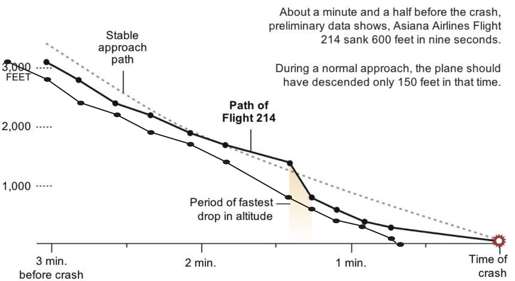
At about 11:28 a.m. PDT on July 6, Asiana Airlines flight 214 crashed at the approach end of runway 28L at San Francisco International Airport (KSFO). The next day, the New York Times reported that the aircraft sank 600 feet in nine seconds (a rate of 4000 feet per minute) less that a minute and a half from impact. That’s an extraordinary sink rate, equivalent to a vertical velocity of 45.4 miles per hour. If true, that would be newsworthy. Indeed, I argued in my previous post that there was a very rapid descent at about that time, necessitated by a too fast, too high, unstabilized approach. But nothing in the data I saw suggests a 4000 fpm descent. Indeed, NTSB chairman Deborah Hersman felt compelled to deny at her July 8 briefing that AAR 214 descended at 4000 fpm. How did the New York Times reach that conclusion, and was it a plausible conclusion from the data?
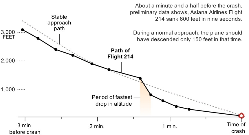
The New York Times graphic is reproduced below [Note: The link now points to the graphic as corrected by the Times]:
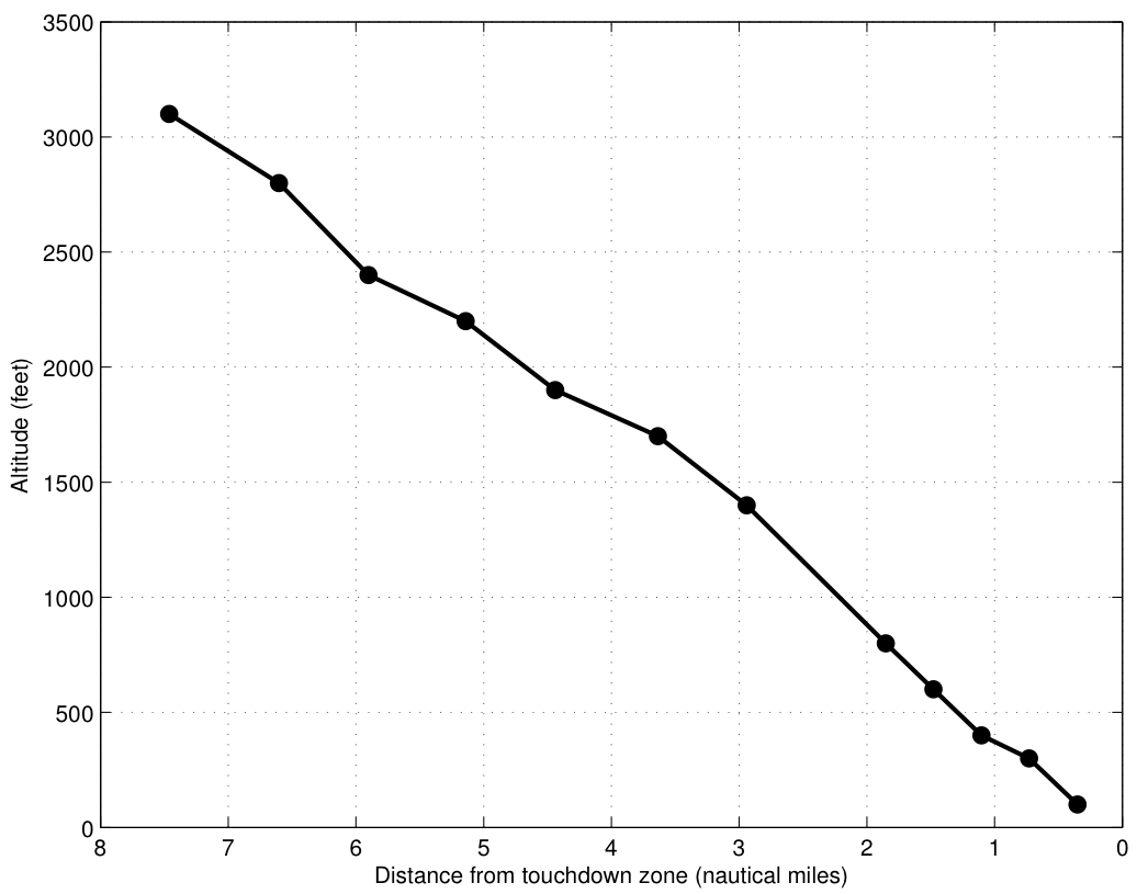
The New York Times credits FlightAware for the data. In my previous post, I produced a similar graphic, also using data from FlightAware, with the horizontal axis distance from the touchdown zone rather than time before crash. I’m reproducing that graphic below, slightly modified to make it clearer:
Our plots agree in some aspects, and differ in others. First, it’s clear the data is from the same source. We plot the same data in the vertical direction (I have one later data point than they do), with points at 3100 ft, 2800 ft, and so on. Their curve is generally more concave up. That makes sense, because their ![]() axis is time and mine is distance. A linear descent path on my plot would be concave up on theirs, because as the plane slows, it’s descent rate also decreases.
axis is time and mine is distance. A linear descent path on my plot would be concave up on theirs, because as the plane slows, it’s descent rate also decreases.
What’s not clear, though, is why they show such a short time interval between the points at 1400 ft and 800 ft, when I show a much longer (distance) interval. Because descent rate is just vertical distance travel per unit time, incorrectly labeling the time of the data points can give a big error. I believe the time interval was closer to 26 seconds than 9 seconds. Of course, that makes all the difference in the world. Which is right (or closest to right), and how would we get that from the data?
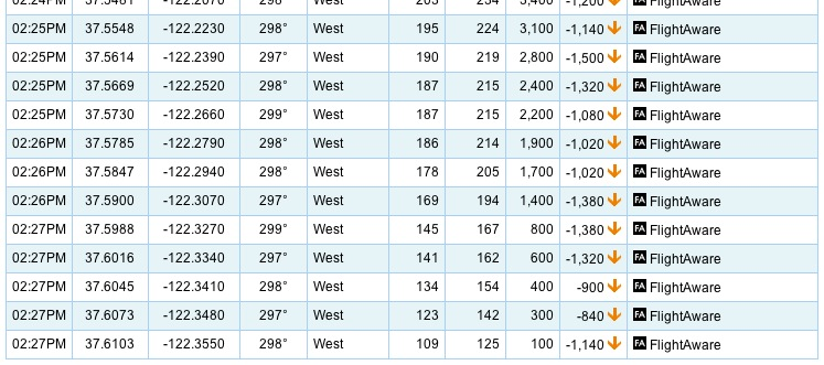
The data we both (apparantly) used is available here for now. I’ve reproduced the table as a graphic (with most of the flight cut out) below:
A couple things stand out right away. The first is that the time is given in hours and minutes, not hours, minutes, and seconds. So it’s impossible to tell (from this data set) how many seconds there are between each data point. A second point to notice is that the rate of descent is given, but the units for that rate are not given. For the period in question, the rate is given as -1,380. The units are certainly feet per minute, as can be verified by looking at a long range descent in the data.
It’s worth taking a moment to understand where all this data comes from. I couldn’t find it on the FlightAware site, but the data almost certainly comes directly or indirectly from the Aircraft Situation Display to Industry (ASDI) data feed, which is a service made available through the U.S. Department of Transportation’s Volpe Transportation Center showing the location, altitude, speed, and flight plans of aircraft on IFR flight plans in the U.S. The data ultimately comes from air traffic control radars (more on them later). The data is time-stamped to fractions of a second, but it appears that FlightAware has truncated the data down to minutes. It would be better to get the raw data from an ASDI vendor directly. I’m not sure how to do that, but it can be done.
It’s also important to understand the limitations of the data. In the San Francisco airspace, all aircraft would be operating with a Mode C or Mode S transponder. Transponders respond to radar interrogations with a 4-digit code identifying the aircraft, as well as the pressure altitude of the aircraft. The altitude is rounded to the nearest 100 feet in Mode C, and the nearest 25 feet in Mode S. In any event, the ASDI data (or at least the FlightAware data) is quantized to 100 ft. That means that each altitude measurement is good to (pm 50) ft and the difference between any two altitude measurements to determine descent rate is good to (pm 100) ft, in the worst case. So the difference of 600 ft over 9 seconds reported by the Times could really be 500 ft or 700 ft.
Furthermore, encoding altimeters report pressure altitude, not altitude above sea level or altitude above ground. The altimeter the pilot uses is adjusted to indicate altitude of sea level by dialing in the sea level pressure as measured at the airfield in the altimeter Kollsman window. I believe (but I’m not certain) that the ASDI data stream includes corrections for local airfield pressure (QNH). If not, the altitude data would need to be corrected for that as well. That would affect the altitude, but not the altitude rate. In any event, the pressure at the time of the accident was near standard, so only a 100 ft correction would need to be made.
There are more complications when using radar data. The accuracy of the data depends on the distance of the radar station to the aircraft. In addition, there may be overlapping coverage by more than one radar. The nearby radar measurement is accurate, but the distant radar is less accurate. Those data are combined in the ASDI stream, and can be problematic.
Furthermore, if there are two radars involved, there can be registration errors. That is, there are systematic biases that will displace the apparent location of the aircraft. When the data from the two radars are combined, it appears that the path of the aircraft is a zig-zag, when of course it isn’t. I don’t think that happened here, but that fact is that most real world datasets are messy, and the ASDI dataset is very messy, because of the complexity of the system. The point is, one must be very careful about how one uses this data.
(I haven’t mentioned ADS-B data, which is a whole other topic. Suffice it to say that it doesn’t make the dataset any less messy, although it might be more accurate.)
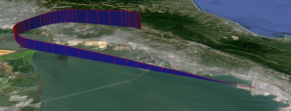
For the issue at hand here, there’s another problem. The radar interrogates the aircraft transponder periodically, with the period depending on the type of radar. So the data are generally regularly spaced. But it appears that FlightAware down samples the ASDI stream to limit the amount of data. At most, there are about 5 or 6 data points per minute. But the rate may be lower. It appears that it is selectively down sampled, with straight line segments having fewer samples per minute. This makes sense, as it allows more accurate plotting of turns. See, for example, this plot of the final approach of Flight 214:
Each vertical line along the path is a data point. Note that the data are denser in the turns, and less so along the straight line path. That’s unfortunate for armchair investigators in the blogosphere and at the Times, because the data is least dense where we care the most.
So how did the Times conclude that there was only a 9 second interval between the two critical data points? I can’t quite figure that out, because there’s no time stamp that accurate on the FlightAware data, but we know that the horizontal distance (calculated from the latitude and longitude data) is 1.088 nautical miles. If indeed only 9 seconds had elapsed, the groundspeed would be 435 kts, which is clearly not right. According to the data, the groundspeed was between 145 and 169 kts, which is certainly in the right ballpark. Taking the midpoint of 157 kts, that implies a time between data points of 24.9 seconds, with a possible range (depending on whether we use the higher or lower groundspeed) of 23.1 seconds and 27 seconds. That’s much more reasonable. Furthermore, the 1380 fpm descent indicated in the FlightAware data over 600 ft implies a time interval of 26.1 seconds.
There is one possibility that would explain where the 9 second number came from. KSFO is served by Northern California Terminal Radar Approach Control (NorCal approach for short), which has an ASR-9 radar stationed in Oakland. The rotation rate of the ASR-9 is 12.5 RPM, or one sweep every 4.5 seconds. They may have assumed that the interval was two revolutions of the radar. (OK, we’re really reaching here.) It’s more likely that the interval is six revolutions, which is exactly 27 seconds, but it could be five revolutions, which would be 22.5 seconds. But as we’ve said, the dataset is messy, and you certainly can’t conclude anything about the data rate from the FlightAware data.
The bottom line is that the New York Times appears to have misunderstood or misinterpreted the data, and compounded that by not cross-checking their result for reasonableness.
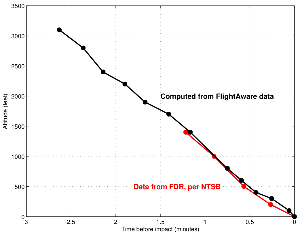
We can take this analysis one step further, because we’re professors, and that’s what we do. We can work backwards (integrate) from the point of impact, using the groundspeed and distance information from FlightAware to back calculate the time before impact, since that data isn’t really available in FlightAware. By doing so, we can correct the New York Times graphic. It also turns out that the NTSB reported the same data at their briefing yesterday, so we can compare to that as well. The results are below:
Our results have a very close fit to the NTSB data, especially considering that the data is quantized to 100 ft. As a (not professional) pilot, this result certainly makes a lot more sense. Flight 214 didn’t suddenly plunge at a 4000 fpm rate, but it wasn’t on a stabilized approach, either. It’s not nearly as dramatic as the Times graphic, but the data is what it is.
I’ve emailed the New York Times reporter asking for comments on the apparent error. I’ll update this post if I get any.
H/T to Kenneth for producing the last plot in this post.
Update July 10
I got a very nice email from Derek Watson, Graphics Editor at the New York Times. He explained that they had received time-stamped data directly from FlightAware, with time stamps to the second. He told me that the time stamps for the data points at 1400 ft and 800 feet were 11:27:04 AM and 11:27:13 AM (PDT), respectively. That didn’t seem right, since the truncated time stamp for the 1400 ft data point on the public FlightAware site is 11:26. Whether the time is rounded or truncated, it would have to be 11:27. I suggested to him that the time stamps provided by FlightAware had been mis-registered. (That could happen easily, say, with a cut-and-paste error on a spreadsheet.) I produced this graphic:
showing that our synthesized times stamps line up exactly with their more accurate time stamps, indicating that the time stamps were in fact misaligned by one. I just received an email confirming, where he says,
Thanks for the emails. I’ve received a reply from FlightAware that confirms your suspicion – the timestamps do seem to have somehow been mis-aligned with the altitude data by one entry. A quick look at the new data seems to match your plots.
So that confirms it. Thanks to Mr. Watson for graciously replying.
Update 2, July 11
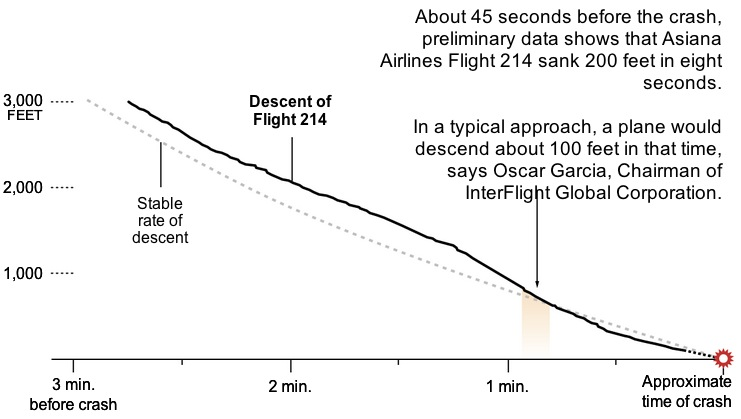
The New York Times corrected the graphic last night. Their new graphic is shown below:
I like this new graphic — it pretty clearly shows the point at 78 seconds out where the power reduction was made. It also now clearly shows that the aircraft was first well above, then below the desired path, which highlights that the approach was unstabilized. Obviously, I would prefer the ![]() axis be distance, not time, but c’est la vie.
axis be distance, not time, but c’est la vie.


My guess is that what happened is that the data that the Times intended to plot was roughly:
time/height
2:20 1900
2:05 1700
1:55 1400
1:25 800
1:15 600
But then the Times accidentally dropped a time stamp, shifting the time stamp column values up to produce the following data points:
time/height
2:05 1900
1:55 1700
1:25 1400
1:15 800
1:05 600
That would explain the apparent rapid descent because the drop from 1400 to 800 feet now takes place over a 10 second interval rather than a 30 second interval.
The Times appears to have made a second error as well, showing the time of the crash as 30 seconds later than it actually occurred.
Clearly there were major deviations from standard procedure that were conducted by the Asiana crew. In the event the 777 had touched down further down the runway and landed without incident, would the fact that they were on a too fast, too high, unstabilised approach have been brought to anyone’s attention? My question is, does this sort of piloting go unnoticed all the time because after a successful landing, it becomes irrelevant?
Your analysis of this mishap has been nothing short of brilliant.
(BTW, I am a current MD11 pilot, so I can tell when brilliance is in this particular room.)
Thanks for the kind words, although I’m not sure about it being brilliant. I do (obviously) have a thing about data and getting it right.
Great job catching that error, it reinforces the need for analysts to always gut check/double check their data. I see NYT corrected it, but don’t see a note acknowledging the error and your contribution.
I didn’t copy that part, but if you click on the link for the graphic, it says, “Because of a data error, an earlier version of this graphic inaccurately described how quickly the plane descended. The corrected data shows that the plane descended 200 feet in 8 seconds, not 600 feet in 9 seconds.” I don’t think they ever acknowledge the source of the correction. But the Graphics Editor has been very gracious in emails to me.
I just wonder is anyone considering wake turbulence? I landed a heavy B767 in somewhat calm winds right before the B777 that crashed?
Just a thought..
That’s interesting, actually. Since wake vortices tend to convect down until they are near the ground, the wake vortex of the previous aircraft might have had an influence on Flight 214, especially since it was near stall at impact. The FDR data may shed light on that. Of course, wake vortex avoidance is another reason to avoid flying below the normal glidepath.